Custom UI
You can display custom user interface (UI) JSX components using the
@metamask/snaps-sdk module when
implementing the following features:
JSX is supported in the MetaMask extension and Flask version 12 and later. New UI components will be added as JSX components. The previous function-based library is deprecated.
To use custom UI, first install @metamask/snaps-sdk
using the following command:
yarn add @metamask/snaps-sdk
Then, whenever you're required to return a custom UI component, import the components from the
SDK at @metamask/snaps-sdk/jsx and build your UI with them.
For example, to display a Box using
snap_dialog:
import { Box, Heading, Text } from '@metamask/snaps-sdk/jsx'

await snap.request({
  method: 'snap_dialog',
  params: {
    type: 'alert',
    content: (
      <Box>
        <Heading>Alert heading</Heading>
        <Text>Something happened in the system.</Text>
      </Box>
    ),
  },
})
JSX can only be used in .jsx or .tsx files.
Components
The following custom UI components are available:
Address
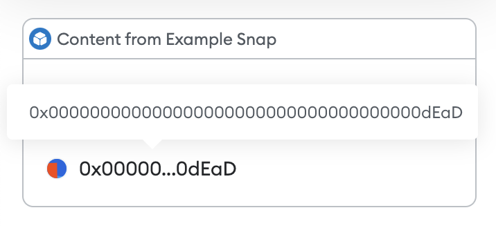
Outputs a formatted text field for a blockchain address. The address is automatically displayed with a Jazzicon and truncated value.
Props
address:string- A valid Ethereum address, starting with0x, or a valid CAIP-10 address.truncate:boolean- (Optional) Whether to truncate the address. The default istrue.displayName:boolean- (Optional) Whether to display the internally saved account label in place of the address. The default istrue.avatar:boolean- (Optional) Whether to show the address Jazzicon. The default istrue.
Example
- Ethereum address
- CAIP-10 address
import { Box, Heading, Address } from '@metamask/snaps-sdk/jsx'

await snap.request({
  method: 'snap_dialog',
  params: {
    type: 'alert',
    content: (
      <Box>
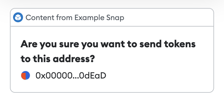
        <Heading>Are you sure you want to send tokens to this address?</Heading>
        <Address address="0x000000000000000000000000000000000000dEaD" />
      </Box>
    ),
  },
})
import { Box, Heading, Address } from '@metamask/snaps-sdk/jsx'

await snap.request({
  method: 'snap_dialog',
  params: {
    type: 'alert',
    content: (
      <Box>
        <Heading>The following is an Ethereum address</Heading>
        <Address address="eip155:1:0x1234567890123456789012345678901234567890" />
        <Heading>The following is a Bitcoin address</Heading>
        <Address address="bip122:000000000019d6689c085ae165831e93:128Lkh3S7CkDTBZ8W7BbpsN3YYizJMp8p6" />
      </Box>
    ),
  },
})
Avatar
Outputs a Jazzicon for an address.
Props
address:string- A valid CAIP-10 address.size:string- (Optional) The size of the avatar. Possible values are"sm","md", and"lg". The default is"md".
MetaMask automatically calculates checksums for EVM addresses (eip155:).
Addresses for other namespaces are not validated; you should validate them in your Snap.
Example
export const onHomePage: OnHomePageHandler = async () => {
  return {
    content: (
      <Box>
        <Avatar address="eip155:1:0x1234567890123456789012345678901234567890" size="lg" />
        <Avatar address="bip122:000000000019d6689c085ae165831e93:128Lkh3S7CkDTBZ8W7BbpsN3YYizJMp8p6" />
      </Box>
    ),
  };
};
Banner
Outputs a banner that can be used to display important messages with different severity levels.
Props
title:string- The title of the banner.severity- The severity level of the banner. Possible values are"danger","info","success", and"warning".children- The content to display in the banner. This can includeText,LinkIcon,Button, andSkeletoncomponents.
Example
import { Box, Banner, Text, Link } from '@metamask/snaps-sdk/jsx'

await snap.request({
  method: 'snap_dialog',
  params: {
    type: 'alert',
    content: (
      <Box>
        <Banner title="Important Update" severity="info">
          <Text>A new version is available!</Text>
          <Link href="https://docs.metamask.io">Learn more</Link>
        </Banner>

        <Banner title="Warning" severity="warning">
          <Text>Please review transaction details carefully.</Text>
        </Banner>

        <Banner title="Success" severity="success">
          <Text>Transaction completed successfully.</Text>
        </Banner>

        <Banner title="Error" severity="danger">
          <Text>Unable to process transaction.</Text>
        </Banner>
      </Box>
    ),
  },
})
Bold
Outputs bold text.
Example
import { Box, Heading, Text, Bold } from '@metamask/snaps-sdk/jsx'

await snap.request({
  method: 'snap_dialog',
  params: {
    type: 'alert',
    content: (
      <Box>
        <Heading>Hello world!</Heading>
        <Text>
          This is <Bold>bold</Bold>.
        </Text>
      </Box>
    ),
  },
})
Box
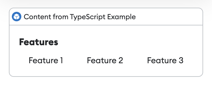
Outputs a box, which can be used as a container for other components.
Props
direction- (Optional) The direction in which elements flow inside the box. Possible values are"horizontal"and"vertical". The default is"vertical".alignment- (Optional) The alignment of the elements inside the box. Possible values are"start","center","end","space-between", and"space-around". The default is"start".center:boolean- (Optional) Whether to center the children within the box. The default isfalse.
Example
import { Box, Heading, Text } from '@metamask/snaps-sdk/jsx'

module.exports.onHomePage = async () => {
  return {
    content: (
      <Box>
        <Heading>Features</Heading>
        <Box direction="horizontal" alignment="space-around" center="true">
          <Text>Feature 1</Text>
          <Text>Feature 2</Text>
          <Text>Feature 3</Text>
        </Box>
      </Box>
    ),
  }
}
Button
Outputs a button that the user can select. For use in interactive UI.
Props
children- The contents of the button. This can be text, anImagecomponent, or anIconcomponent.type- (Optional) The type of button. Possible values are"button"and"submit". The default is"button".name:string- (Optional) The name that will be sent toonUserInputwhen a user selects the button.variant- (Optional) Determines the appearance of the button. Possible values are"primary"and"destructive". The default is"primary".
Example
import { Box, Heading, Button } from '@metamask/snaps-sdk/jsx'

const interfaceId = await snap.request({
  method: 'snap_createInterface',
  params: {
    ui: (
      <Box>
        <Heading>Interactive interface</Heading>
        <Button name="interactive-button">Click me</Button>
      </Box>
    ),
  },
})

await snap.request({
  method: 'snap_dialog',
  params: {
    type: 'Alert',
    id: interfaceId,
  },
})

Card
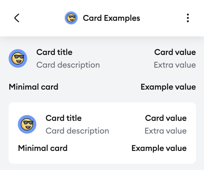
Outputs a card component which is used to display values in a card structure.
Unlike many Card components from other UI libraries, the Snaps Card does not have any shape.
It is only used for layout. To give a shape to a Card, wrap it in a Section
component.
Props
title:Array<string | Address>- The title of the card, can be a string or anAddress.value:string- The value, shown on the right side.image:string- (Optional) An image shown on the left side. Accepts inline SVG.description:string- (Optional) A description, shown below the title.extra:string- (Optional) Additional text shown below the value.
Example
import icon from "./../img/icon.svg"

export const onHomePage: OnHomePageHandler = async () => {
  return {
    content: (
      <Box>
        <Card
          image={icon}
          title="Card title"
          description="Card description"
          value="Card value"
          extra="Extra value"
        />
        <Card
          title="Minimal card"
          value="Example value"
        />
        <Section>
          <Card
            image={icon}
            title="Card title"
            description="Card description"
            value="Card value"
            extra="Extra value"
          />
          <Card
            title="Minimal card"
            value="Example value"
          />
        </Section>
      </Box>
    ),
  };
};
Checkbox
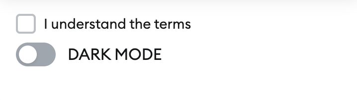
Outputs a checkbox for use in interactive UI.
Props
name:string- The name sent toonUserInput.checked:boolean- (Optional) Whether the checkbox is checked.label:string- (Optional) The label for the checkbox.variant- (Optional) The variant of the checkbox. Possible values are"default"and"toggle". The default is"default".
Example
import { Checkbox } from '@metamask/snaps-sdk/jsx'

const interfaceId = await snap.request({
  method: 'snap_createInterface',
  params: {
    ui: (
      <Box>
        <Checkbox name="accept-terms" label="I understand the terms" />
        <Checkbox name="dark-mode" label="Dark mode" variant="toggle" />
      </Box>
    ),
  },
})
Container
Outputs a container component that can hold a box of content and an optional footer. This is useful for creating structured layouts with action buttons at the bottom in custom dialogs.
Props
backgroundColor- (Optional) The background color of the container. Possible values are"default"and"alternative". The default is"default".children: The contents of the container. This can be a singleBoxcomponent, or an array containing aBoxcomponent and aFootercomponent.
Example
import { Container, Box, Footer, Text, Button } from '@metamask/snaps-sdk/jsx'

await snap.request({
  method: 'snap_dialog',
  params: {
    content: (
      <Container backgroundColor="default">
        <Box>
          <Text>Are you sure you want to proceed with this transaction?</Text>
          <Text>Gas fees: 0.005 ETH</Text>
        </Box>
        <Footer>
          <Button name="cancel" variant="destructive">
            Cancel
          </Button>
          <Button name="confirm">Confirm</Button>
        </Footer>
      </Container>
    ),
  },
})

// Example without footer
await snap.request({
  method: 'snap_dialog',
  params: {
    content: (
      <Container backgroundColor="alternative">
        <Box>
          <Text>Simple container without footer</Text>
        </Box>
      </Container>
    ),
  },
})
Copyable
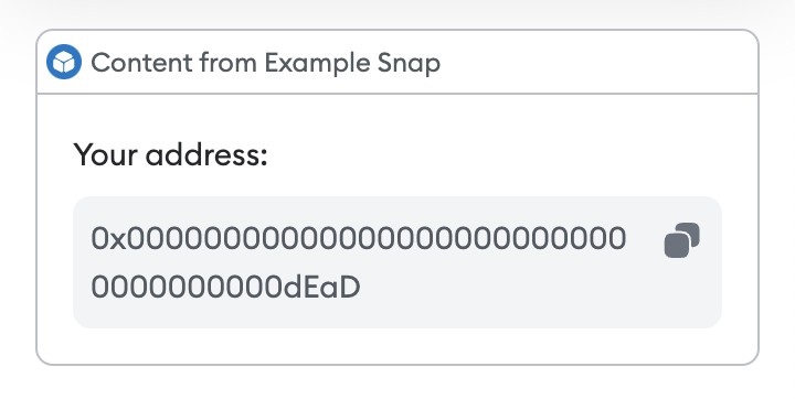
Outputs a read-only text field with a copy-to-clipboard shortcut.
Props
value:string- The value to copy when the user clicks on the copyable element.sensitive:boolean- (Optional) Indicates whether the value is sensitive. Iftrue, the value will be hidden when the user is not interacting with the copyable element.
Example
import { Box, Text, Copyable } from '@metamask/snaps-sdk/jsx'

await snap.request({
  method: 'snap_dialog',
  params: {
    type: 'alert',
    content: (
      <Box>
        <Text>Your address:</Text>
        <Copyable value="0x000000000000000000000000000000000000dEaD" />
      </Box>
    ),
  },
})
Divider
Outputs a horizontal divider.
Example
import { Box, Heading, Divider, Text } from '@metamask/snaps-sdk/jsx'

module.exports.onHomePage = async () => {
  return {
    content: (
      <Box>
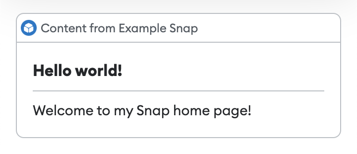
        <Heading>Hello world!</Heading>
        <Divider />
        <Text>Welcome to my Snap home page!</Text>
      </Box>
    ),
  }
}
Dropdown
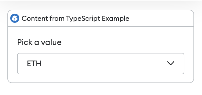
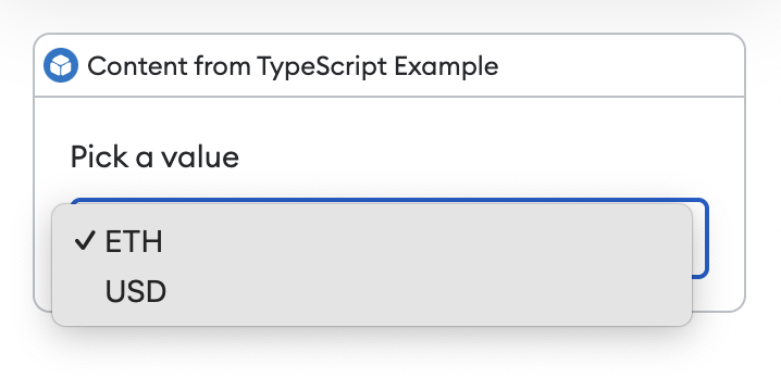
Outputs a dropdown for use in interactive UI.
Props
name:string- The name sent toonUserInput.children:Option[]- One or moreOptioncomponents with the following props:value:string- The value sent toonUserInput.children:string- The text displayed in the dropdown for that option.
Example
import { Box, Text, Dropdown } from '@metamask/snaps-sdk/jsx'

const interfaceId = await snap.request({
  method: 'snap_createInterface',
  params: {
    ui: (
      <Box>
        <Text>Pick a currency</Text>
        <Dropdown name="currency">
          <Option value="ETH">ETH</Option>
          <Option value="USD">USD</Option>
        </Dropdown>
      </Box>
    ),
  },
})

await snap.request({
  method: 'snap_dialog',
  params: {
    type: 'Alert',
    id: interfaceId,
  },
})
Field
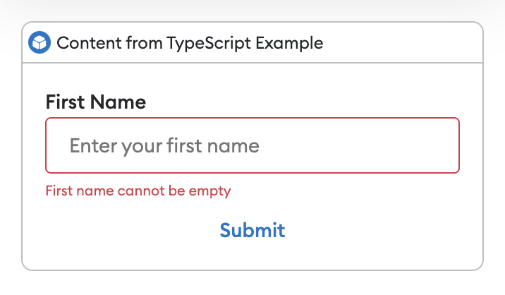
Outputs a form field, wrapping an element to give it a label and optional error.
Props
label:string- The label for the wrapped element.error:string- (Optional) Any error for the wrapped element. Setting this changes the style of the wrapped element to show that there is an error.children- The element to be wrapped. This can be aDropdown,Input,Selector, orRadioGroupcomponent.
Example
import { Field, Form, Input, Button } from '@metamask/snaps-sdk/jsx'

const interfaceId = await snap.request({
  method: 'snap_createInterface',
  params: {
    ui: (
      <Form name="form-to-fill">
        <Field label="First Name">
          <Input name="firstName" placeholder="Enter your first name" />
        </Field>
        <Button type="submit">Submit</Button>
      </Form>
    ),
  },
})

await snap.request({
  method: 'snap_dialog',
  params: {
    type: 'Alert',
    id: interfaceId,
  },
})
FileInput
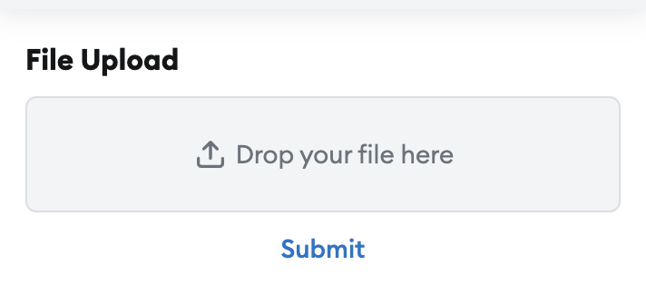
Outputs a file input component for use in interactive UI.
Props
name:string- The name that will be sent toonUserInputwhen a user interacts with the form.accept:string[]- (Optional) The file types that the file input field accepts. If not specified, the file input field accepts all file types. For examples of valid values, see the MDN documentation.compact:boolean- (Optional) Whether the file input field is compact.
Example
import { FileInput } from '@metamask/snaps-sdk/jsx'

export const onHomePage = async () => {
  const interfaceId = await snap.request({
    method: 'snap_createInterface',
    params: {
      ui: (
        <Box>
          <Heading>File Upload</Heading>
          <Form name="file-upload-form">
            <Field>
              <FileInput name="file-input" />
            </Field>
            <Button name="submit-file-upload-form" type="submit">
              Submit
            </Button>
          </Form>
        </Box>
      ),
    },
  })

  return {
    id: interfaceId,
  }
}

export const onUserInput = async ({ id, event }) => {
  if (event.type === UserInputEventType.FileUploadEvent && event.file !== null) {
    console.log(event.file)
  }
}
Footer
Outputs a footer that can contain one or two buttons. This component is typically used within a Container to create action buttons at the bottom of a dialog or panel.
Props
children- The contents of the footer. This can be one or twoButtoncomponents.
Example
import { Container, Box, Footer, Text, Button } from '@metamask/snaps-sdk/jsx'

// Example with two buttons
await snap.request({
  method: 'snap_dialog',
  params: {
    content: (
      <Container>
        <Box>
          <Text>Delete this item?</Text>
        </Box>
        <Footer>
          <Button name="cancel">Cancel</Button>
          <Button name="delete" variant="destructive">
            Delete
          </Button>
        </Footer>
      </Container>
    ),
  },
})

// Example with single button
await snap.request({
  method: 'snap_dialog',
  params: {
    content: (
      <Container>
        <Box>
          <Text>Operation completed successfully.</Text>
        </Box>
        <Footer>
          <Button name="close">Close</Button>
        </Footer>
      </Container>
    ),
  },
})
Form
Outputs a form for use in interactive UI.
Props
name:string- The name that will be sent toonUserInputwhen a user interacts with the form.children:array- An array ofInputorButtoncomponents.
Example
import { Box, Section, Form, Input, Button } from '@metamask/snaps-sdk/jsx'

const interfaceId = await snap.request({
  method: 'snap_createInterface',
  params: {
    ui: (
      <Box>
        <Section>
          <Form name="form-to-fill">
            <Field label="First Name">
              <Input name="firstName" placeholder="Enter your first name" />
            </Field>
            <Button type="submit">Submit</Button>
          </Form>
        </Section>
      </Box>
    ),
  },
})

await snap.request({
  method: 'snap_dialog',
  params: {
    type: 'Alert',
    id: interfaceId,
  },
})

Heading
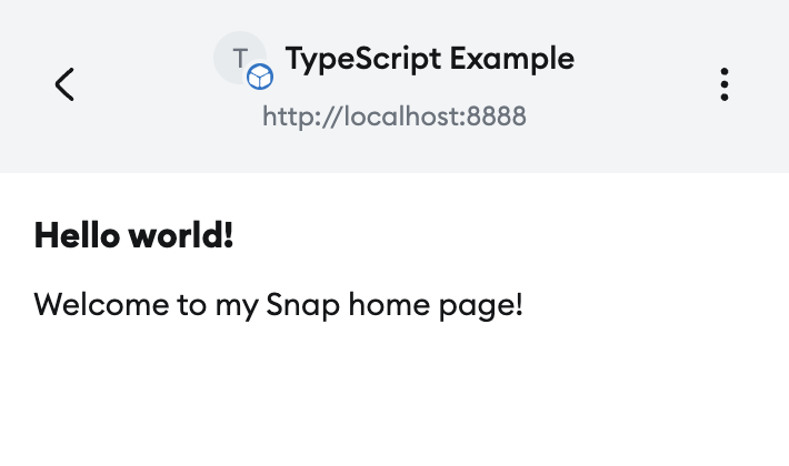
Outputs a heading.
This is useful for Box titles.
Props
size:string- (Optional) The size of the heading. Possible values are"sm","md", and"lg". The default is"sm".
Example
import { Box, Heading, Text } from '@metamask/snaps-sdk/jsx'

module.exports.onHomePage = async () => {
  return {
    content: (
      <Box>
        <Heading>Hello world!</Heading>
        <Text>Welcome to my Snap home page!</Text>
      </Box>
    ),
  }
}
Icon
Outputs an icon.
Props
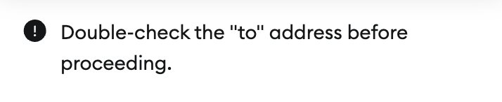
name- The name of the icon. Possible values include"confirmation","search", "warning", and"menu". See the full list of possiblenamevalues.color- (Optional) The color of the icon. Possible values are"default","primary", and"muted". The default is"default".size- (Optional) The size of the icon. Possible values are"md"and"inherit". The default is"md".
Example
import { Icon } from '@metamask/snaps-sdk/jsx'

await snap.request({
  method: 'snap_dialog',
  params: {
    type: 'alert',
    content: (
      <Box direction="horizontal">
        <Icon name="warning" size="md" />
        <Text>Double-check the "to" address before proceeding.</Text>
      </Box>
    ),
  },
})
Image
Outputs an image. This component takes an inline SVG. It does not support remote URLs.
You can import SVG, PNG, and JPEG files using an import statement.
These files are automatically imported as SVG strings, so you can pass them directly to the
Image component.
The SVG is rendered within an <img> tag, which prevents JavaScript or interaction events from
being supported.
To disable image support, set the features.images
configuration option to false.
The default is true.
Props
src:string- An inline SVG.alt:string- An optional alternative text for the image.
Example
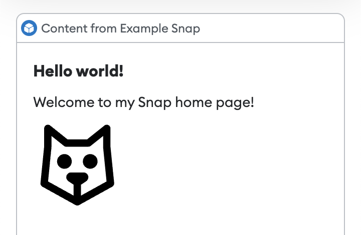
import { Box, Heading, Text, Image } from '@metamask/snaps-sdk/jsx'
import svgIcon from './path/to/icon.svg'

module.exports.onHomePage = async () => {
  return {
    content: (
      <Box>
        <Heading>Hello world!</Heading>
        <Text>Welcome to my Snap home page!</Text>
        <Image src={svgIcon} />
      </Box>
    ),
  }
}
See the @metamask/images-example-snap
package for a full example of implementing images.
Input
Outputs an input component for use in interactive UI.
Props
name:string- The name that will be used as a key to the event sent toonUserInputwhen the containing form is submitted.type- (Optional) The type of input. Possible values are"text","number", and"password". The default is"text".placeholder:string- (Optional) The text displayed when the input is empty.label:string- (Optional) The text displayed alongside the input to label it.value:string- (Optional) The default value of the input.min:string- (Optional) The minimum value of the input field. Only applicable to the input type"number".max:string- (Optional) The maximum value of the input field. Only applicable to the input type"number".step:string- (Optional) The step value of the input field. Only applicable to the input type"number".
Example
import { Form, Input, Button } from '@metamask/snaps-sdk/jsx'

const interfaceId = await snap.request({
  method: 'snap_createInterface',
  params: {
    ui: (
      <Form name="form-to-fill">
        <Field label="First Name">
          <Input name="firstName" placeholder="Enter your first name" />
        </Field>
        <Button type="submit">Submit</Button>
      </Form>
    ),
  },
})

await snap.request({
  method: 'snap_dialog',
  params: {
    type: 'Alert',
    id: interfaceId,
  },
})
Italic
Outputs italic text.
Example
import { Box, Heading, Text, Italic } from '@metamask/snaps-sdk/jsx'

await snap.request({
  method: 'snap_dialog',
  params: {
    type: 'alert',
    content: (
      <Box>
        <Heading>Hello world!</Heading>
        <Text>
          This is <Italic>italic</Italic>.
        </Text>
      </Box>
    ),
  },
})
Link
Outputs a clickable link.
Props
href:string- The URL to point to. Supported schemes arehttps:,mailto:, andmetamask:.http:is not allowed.children:Array<string | Bold | Italic | Address>- The link text, or anAddress.
About metamask: URLs
A Snap can link to the following screens using the metamask: scheme:
metamask://client/- Leads to the main screen of MetaMask.metamask://snap/[Snap ID]/home/- Leads to the Snap's home page, or the Snap's settings page if it does not have a home page. Valid Snap IDs are npm IDs beginning withnpm:, such asmetamask://snap/npm:@consensys/starknet-snap/home, orlocal:, such asmetamask://snap/local:http://localhost:8080/home. Consider using environment variables so you can have different Snap IDs for local testing and production.
- MetaMask will throw an error if the URL is not valid or if the URL leads to a Snap that is not installed.
metamask:URLs are not supported in dialogs.
Example
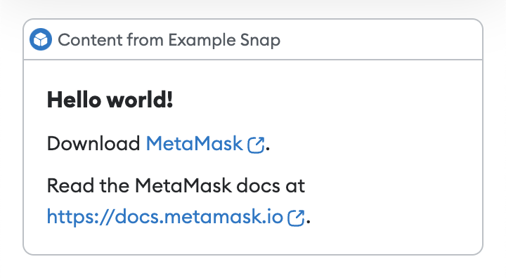
import { Box, Heading, Link, Text } from '@metamask/snaps-sdk/jsx'

module.exports.onHomePage = async () => {
  return {
    content: (
      <Box>
        <Heading>Hello world!</Heading>
        <Text>
          Download <Link href="https://metamask.io">MetaMask</Link>.
        </Text>
        <Text>
          Read the MetaMask docs at <Link href="https://docs.metamask.io">MetaMask docs</Link>.
        </Text>
      </Box>
    ),
  }
}
RadioGroup
Outputs a radio group component for use in interactive UI.
Props
name:string- The name that will be used as a key to the event sent toonUserInputwhen the containing form is submitted.children:Radio[]- One or moreRadiocomponents, each with avalueand text child.
Example
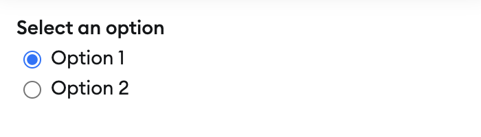
import { RadioGroup, Radio } from '@metamask/snaps-sdk/jsx'

const interfaceId = await snap.request({
  method: 'snap_createInterface',
  params: {
    ui: (
      <Form name="form-example">
        <Field label="Select an option">
          <RadioGroup name="radio-group-example">
            <Radio value="option-1">Option 1</Radio>
            <Radio value="option-2">Option 2</Radio>
          </RadioGroup>
        </Field>
      </Form>
    ),
  },
})
Row
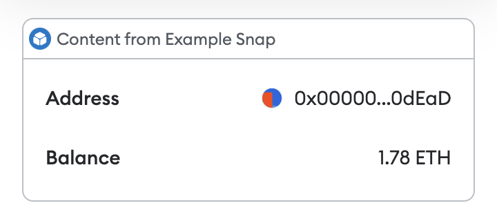
Outputs a row with a label and value, which can be used for key-value data.
Props
label:string- The label of the row.variant- (Optional) The variant of the label. Possible values are"default","error", and"warning". The default is"default".children- The value of the row, which can be aText,Image,Address,Link, orValuecomponent.
Example
import { Box, Row, Text, Address } from '@metamask/snaps-sdk/jsx'

await snap.request({
  method: 'snap_dialog',
  params: {
    type: 'alert',
    content: (
      <Box>
        <Row label="Address">
          <Address address="0x000000000000000000000000000000000000dEaD" />
        </Row>
        <Row label="Balance">
          <Text>1.78 ETH</Text>
        </Row>
      </Box>
    ),
  },
})
Section
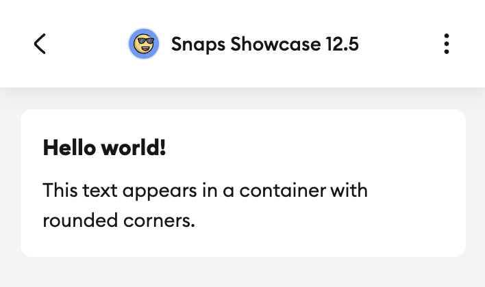
Outputs a styled container for use in dialogs and home pages.
Props
direction- (Optional) The direction in which elements flow inside the box. Possible values are"horizontal"and"vertical". The default is"vertical".alignment- (Optional) The alignment of the elements inside the box. Possible values are"start","center","end","space-between", and"space-around". The default is"start".
Example
export const onHomePage: OnHomePageHandler = async () => {
  return {
    content: (
      <Box>
        <Section>
          <Heading>Hello world!</Heading>
          <Text>This text appears in a container with rounded corners.</Text>
        </Section>
      </Box>
    ),
  };
};
Selector
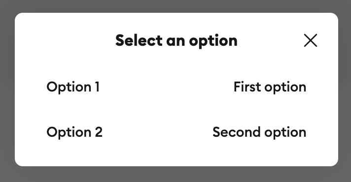
Outputs a selector component for use in interactive UI.
Props
name:string- The name that will be used as a key to the event sent toonUserInputwhen the containing form is submitted.title:string- The title of the selector, displayed when the selector is opened.children:SelectorOption[]- One or moreSelectorOptioncomponents, each with aCardchild.
Example
import { Selector, SelectorOption, Card } from '@metamask/snaps-sdk/jsx'

const interfaceId = await snap.request({
  method: 'snap_createInterface',
  params: {
    ui: (
      <Selector name="selector-example" title="Select an option">
        <SelectorOption value="option-1">
          <Card title="Option 1" value="First option" />
        </SelectorOption>
        <SelectorOption value="option-2">
          <Card title="Option 2" value="Second option" />
        </SelectorOption>
      </Selector>
    ),
  },
})
Skeleton
Outputs an animated loading container.
Props
width:Array<number | string>- (Optional) The width of the skeleton. The default is"100%".height:Array<number | string>- (Optional) The height of the skeleton. The default is22.borderRadius:string- (Optional) The radius of the corners. Possible values are"none","medium"or"full". The default is"medium".
Example
import { Box, Heading, Skeleton } from '@metamask/snaps-sdk/jsx'

await snap.request({
  method: 'snap_dialog',
  params: {
    type: 'alert',
    content: (
      <Box>
        <Heading>Please wait...</Heading>
        <Skeleton height={32} width="50%" borderRadius="full" />
      </Box>
    ),
  },
})
Spinner
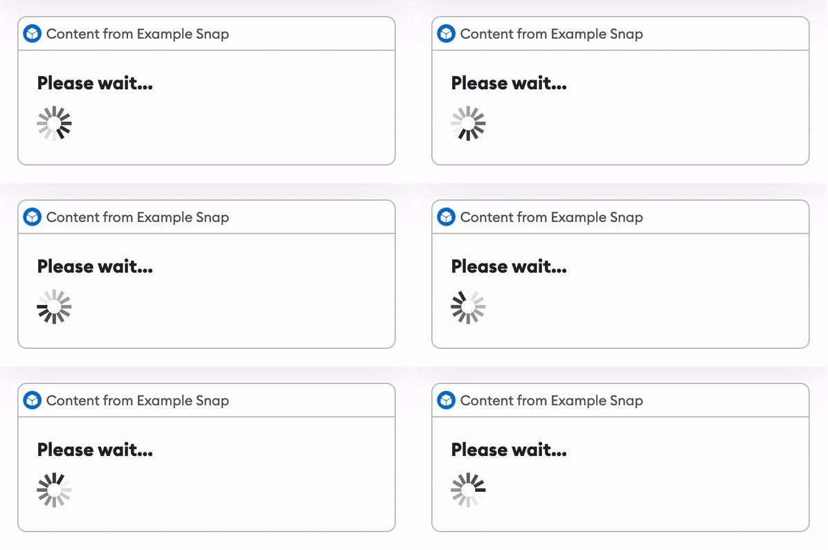
Outputs an animated loading indicator.
Example
import { Box, Heading, Spinner } from '@metamask/snaps-sdk/jsx'

await snap.request({
  method: 'snap_dialog',
  params: {
    type: 'alert',
    content: (
      <Box>
        <Heading>Please wait...</Heading>
        <Spinner />
      </Box>
    ),
  },
})
Text
Outputs text.
Props
color- (Optional) The color of the text. Possible values are"default","alternative","muted","error","success", and"warning". The default is"default".alignment- (Optional) The alignment of the text. Possible values are"start","center", and"end". The default is"start".children- The content to display. This can include strings, andBold,Italic,Icon,Link, andSkeletoncomponents.size- (Optional) The size of the text. Possible values are"sm"and"md". The default is"md".fontWeight- (Optional) The font weight of the text. Possible values are"regular","medium", and"bold". The default is"regular".
Example
import { Box, Heading, Text } from '@metamask/snaps-sdk/jsx'

module.exports.onHomePage = async () => {
  return {
    content: (
      <Box>
        <Heading>Hello world!</Heading>
        <Text>Welcome to my Snap home page!</Text>
      </Box>
    ),
  }
}
Tooltip
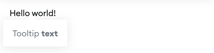
Outputs a tooltip when the wrapped element is hovered over.
Props
content: - The content of the tooltip.children: - The element to wrap.
Example
import { Tooltip, Text } from '@metamask/snaps-sdk/jsx'

await snap.request({
  method: 'snap_dialog',
  params: {
    type: 'alert',
    content: (
      <Box>
        <Tooltip
          content={
            <Text>
              Tooltip <Bold>text</Bold>
            </Text>
          }>
          <Text>Hello world!</Text>
        </Tooltip>
      </Box>
    ),
  },
})
Value
Outputs a component that displays two text values side by side. This component can only be used as a child of the Row component.
Props
value- The value shown on the right side. This can be a string or aTextcomponent.extra- The extra text shown on the left side. This can be a string or aTextcomponent.
Example
import { Box, Row, Text, Value } from '@metamask/snaps-sdk/jsx'

await snap.request({
  method: 'snap_dialog',
  params: {
    type: 'alert',
    content: (
      <Box>
        <Row label="Transaction Amount">
          <Value value="0.05 ETH" extra="$200" />
        </Row>

        {/* Example with styled text */}
        <Row label="Gas Fee">
          <Value
            value={<Text color="error">0.003 ETH</Text>}
            extra={<Text color="error">$12</Text>}
          />
        </Row>

        {/* Example with different text colors */}
        <Row label="Balance After">
          <Value
            value={<Text color="success">1.25 ETH</Text>}
            extra={<Text color="muted">$2,500</Text>}
          />
        </Row>
      </Box>
    ),
  },
})
Emojis
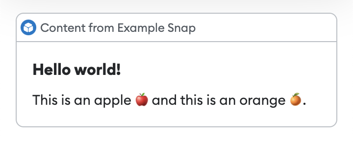
Text-based components (such as Heading and Text) accept emojis.
Example
import { Box, Heading, Text } from '@metamask/snaps-sdk/jsx'

await snap.request({
  method: 'snap_dialog',
  params: {
    type: 'alert',
    content: (
      <Box>
        <Heading>Hello world!</Heading>
        <Text>This is an apple 🍎 and this is an orange 🍊.</Text>
      </Box>
    ),
  },
})
User-defined components
In addition to the components provided by the SDK, you can define your own components.
Upgrade a Snap to use JSX
If you have a Snap that uses the deprecated function-based custom UI library, follow these steps to upgrade it to use JSX:
-
Update dependencies in
packages/snap/package.json:- Upgrade
@metamask/snaps-sdkto^6.1.1or later. - Upgrade
@metamask/snaps-clito^6.2.1or later. - Upgrade
@metamask/snaps-jestto^8.2.0or later. - Add
@types/reactwith version18.2.4(without caret range) underdevDependencies. - Add
@types/react-domwith version18.2.4(without caret range) underdevDependencies.
Run
yarn installto install the new versions. - Upgrade
-
Update
packages/snap/.eslintrc.js:- Add a new section in
overrideswith the following configuration:{"files": ["**/*.ts", "**/*.tsx"],"extends": ["@metamask/eslint-config-typescript"],"rules": {// This allows importing the `Text` JSX component."@typescript-eslint/no-shadow": ["error",{"allow": ["Text"]}]}} - Replace
["*.test.ts"]with["*.test.ts", "*.test.tsx"].
- Add a new section in
-
Update
packages/snap/src/index.ts, if it will have JSX:- Rename the file to
index.tsx. - Modify the
inputfield inpackages/snap/snap.config.tstosrc/index.tsx.
- Rename the file to
-
Update
packages/snap/tsconfig.json:- Under
compilerOptions, add:"jsx": "react-jsx","jsxImportSource": "@metamask/snaps-sdk" - Change the
includeproperty from["**/*.ts"]to["**/*.ts", "**/*.tsx"].
- Under
-
Replace all custom UI in your code with JSX components, renaming the target files with the
.tsxextension.