Customization
Branding
The Branding page lets you personalize the visual identity of your dapp across login screens, MFA screens, the wallet UI, and login modals.
Changes can be previewed in real time. Click Save & Publish to apply them to production.
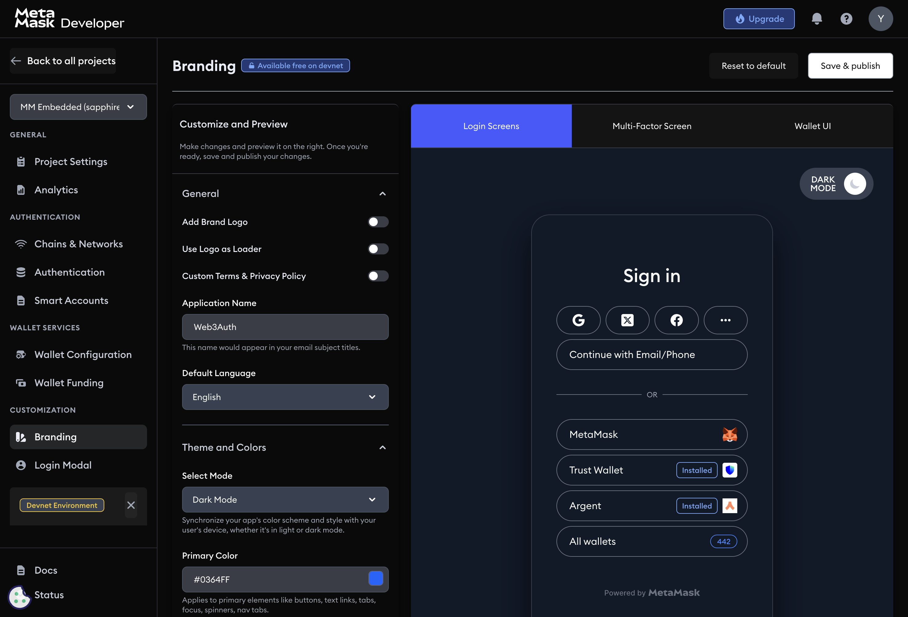
Branding options
Add brand logo
Upload a logo (.png recommended) to personalize the login flow, wallet views, and system emails.
Use logo as loader
When enabled, your uploaded logo replaces the default loading spinner in the Embedded Wallets login flow.
Custom terms and conditions / privacy policy
Link to your terms of service and privacy policy. These links appear during user onboarding, on the consent screen during social login (Web SDK v11), and in other consent flows.
Application name
The name used in system-generated emails, including email subject lines.
Default language
Set the default language for all user-facing Embedded Wallets components. Supported languages:
- English, Japanese, Korean, German, Mandarin, Spanish, French, Portuguese, Dutch, Turkish
Theme and colors
Select mode
Choose Light, Dark, or Auto. Auto adapts to the user's system theme.
Primary color
The primary brand color applied to buttons, links, tab indicators, focus outlines, loaders, and navigation tabs.
On primary color
The color for text and icons that appear on top of primary-color backgrounds (for example, button labels). Choose a combination that meets WCAG contrast guidelines.
Login modal
The Login Modal page controls the appearance and behavior of the authentication flow.
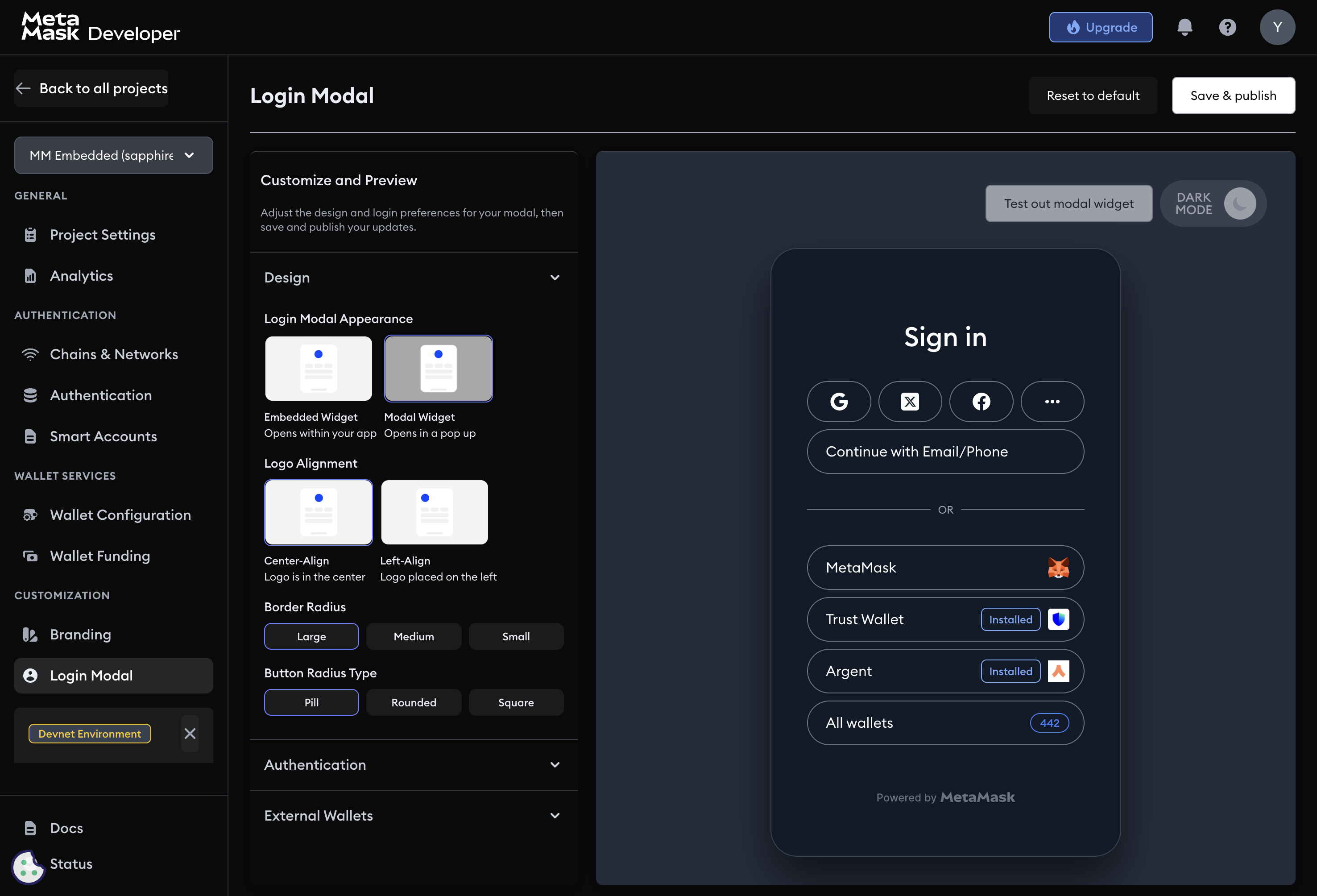
Design
Login modal appearance
Choose how the login UI is displayed:
- Embedded widget: the login UI is embedded in your dapp's layout.
- Modal widget: the login UI opens as a pop-up overlay.
Logo alignment
- Center-aligned: logo appears at the top center.
- Left-aligned: logo appears at the top left.
Border radius
Adjust the corner curvature of the modal: small, medium, or large.
Border radius type
Set the shape of buttons and input fields:
- Pill: fully rounded ends.
- Rounded: gently curved corners.
- Square: sharp 90-degree corners.
Authentication reorder
Drag and drop login methods to set the order in which they appear to users. Prioritize the method most of your users are likely to choose.
External wallets
Show installed external wallets
When enabled, the login modal detects and displays compatible wallets already installed in the user's browser or device, such as MetaMask.
Select number of external wallets
Set how many external wallet options are shown at once.